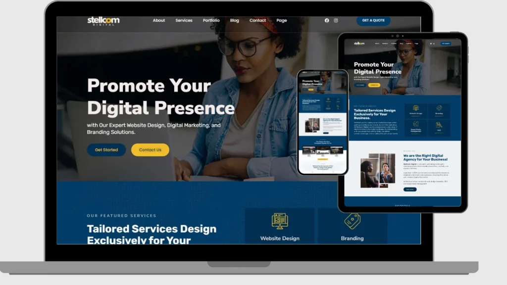

Let’s be honest—how often do you browse websites on your phone? Probably more than you realize, right? That’s the world we’re living in. Mobile browsing has taken over, and if your website isn’t keeping up, you could be missing out on a huge chunk of potential customers.
That’s where responsive website design comes in. It’s not just a trendy term; it’s a game-changer for your business. In this article, we’re diving into why having a mobile-friendly, responsive website isn’t just nice to have—it’s essential for boosting your business.
Table of Contents
What is Responsive Website Design, Exactly?
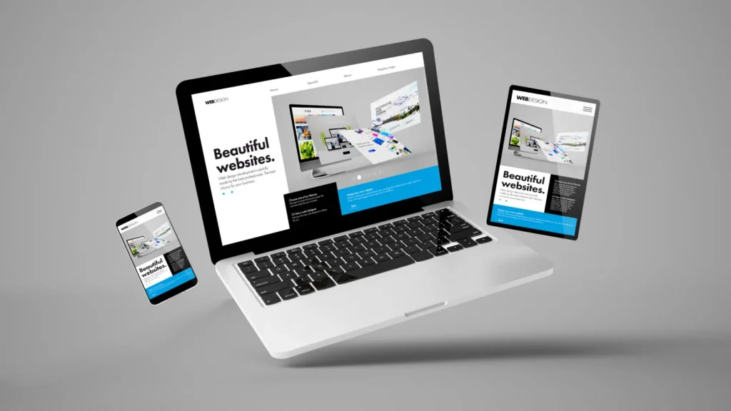
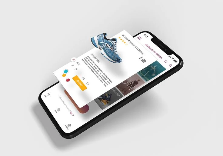
Responsive website design means your site adjusts to fit any screen size, whether someone is browsing on a desktop, tablet, or smartphone. Think of it like water—it takes the shape of whatever container it’s in.
For example:
- On a desktop, your website might have a big, beautiful banner across the top.
- On a phone, that same banner scales down perfectly without cutting off text or images.
Why Being Mobile-Friendly is Non-Negotiable
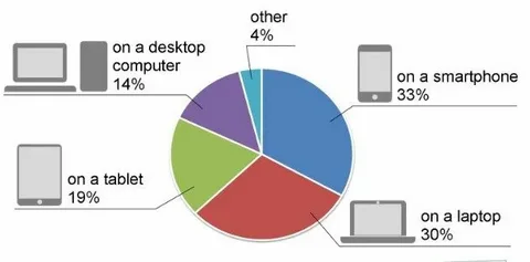
Let’s talk numbers for a second: over 60% of web traffic now comes from mobile devices. That’s more than half your audience. If your site isn’t optimized for mobile, you’re basically telling those visitors, “Thanks, but no thanks.”

Here are a few big reasons why mobile friendliness is critical:
- Everyone’s On Their Phone
Your customers are scrolling through their phones all day, whether it’s to shop, read, or find a local business. If your site doesn’t load well on their device, they’ll bounce—straight to a competitor’s site. - Google Cares About Mobile
Google’s search rankings are a big deal, and guess what? They prioritize mobile-friendly websites. If your site isn’t responsive, you’re not just losing visitors; you’re losing visibility in search results. - Conversions Happen on Mobile
Whether it’s signing up for a newsletter, filling out a contact form, or making a purchase, people are way more likely to complete these actions on a site that works well on their device.

The Big Benefits of a Responsive Website
Let’s get into how a responsive website helps your business grow.
1. It’s All About User Experience

Ever visited a site on your phone where you had to zoom in to read the text or scroll sideways to see everything? Frustrating, right? A responsive design eliminates that hassle. Your site becomes easy to navigate, loads faster, and looks polished—no matter the screen size.
2. SEO Rankings Go Up
Google loves responsive websites, and for good reason. When your site adapts seamlessly to mobile devices, you’re rewarded with higher search engine rankings. That means more people can find your business online.

3. You Save Money in the Long Run
Forget about building separate websites for desktop and mobile. A responsive design combines everything into one site. It’s more cost-effective to build, easier to maintain, and future-proof as new devices come out.
4. Better Conversions
Here’s the bottom line: a mobile-friendly website converts better. From clickable buttons to smooth checkout processes, responsive sites are built to guide visitors through the journey you want them to take—whether that’s making a purchase or contacting you.
5. You Stay Ahead of the Competition
Still have competitors with clunky, outdated websites? Good. A responsive site shows that your business is modern, professional, and focused on customer needs. That’s a competitive edge you can’t ignore. Website design agencies consider this a lot.
How Does Responsive Design Help with SEO?
If you’re wondering how a responsive website ties into your SEO strategy, let’s break it down.
- Mobile-First Indexing
Google now looks at the mobile version of your site first when determining rankings. If your mobile site isn’t up to par, it doesn’t matter how good your desktop version looks—your rankings will suffer. - Faster Loading Speeds
Page speed is a big deal. If your site takes more than three seconds to load, most users will bounce. A responsive design helps by optimizing images and reducing unnecessary elements that slow things down. - Lower Bounce Rates
When users land on your site and it’s easy to use, they’re more likely to stick around. Search engines notice this and reward you with higher rankings. - Stronger Backlinks
Responsive sites use one URL for all devices, which means all backlinks point to the same place. That’s good news for your domain authority and SEO. - Local SEO Benefits
If you’re targeting local customers, a responsive site ensures your business shows up prominently when people search for services in your area—especially on mobile.
Making Your Website Fully Responsive
Ready to make your site responsive? Here’s how to get started:
- Think Mobile First
Design with mobile users in mind from the beginning. If it works on mobile, it’ll be easier to scale up for desktops. - Optimize Your Images
Large images slow down loading times. Use responsive images that adjust to different screen sizes and compress them for faster performance. - Use a Flexible Grid
A grid-based layout ensures your site adapts seamlessly to various screen sizes. Tools like CSS media queries make this easy to implement. - Prioritize Speed
Minimize unnecessary code, enable browser caching, and consider using a Content Delivery Network (CDN) to speed things up. - Test, Test, Test
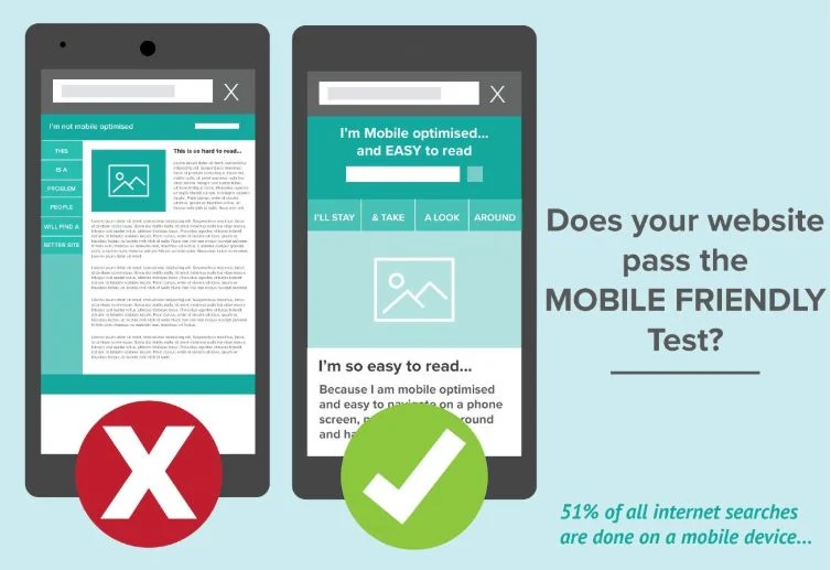
Use tools like Google’s Mobile-Friendly Test to see how your site performs on different devices. Fix any issues before launching.
Real-World Wins: Companies Rocking Responsive Design

Need some inspiration? Check out these brands that nailed responsive design:
- Amazon: Their site adapts flawlessly, offering a seamless shopping experience across all devices.
- Starbucks: From browsing their menu to finding a store, everything’s easy to do on their mobile-friendly site.
- Nike: Nike’s responsive design highlights their products beautifully, driving online sales and brand engagement.
If these giants see the value in responsive design, it’s a clear sign that your business can benefit too.
The Future of Responsive Design

Responsive design isn’t static; it’s evolving. Here’s what’s next:
- Voice Search Optimization: As more people use voice assistants, websites need to adapt for voice search.
- Progressive Web Apps (PWAs): These blend the best of websites and mobile apps, offering an engaging experience.
- AI Personalization: Artificial intelligence can tailor content to users’ preferences, making sites more responsive to their needs.
Final Thoughts
Investing in a responsive website isn’t just about keeping up with the times—it’s about future-proofing your business. When your site is mobile-friendly, your audience sticks around longer, Google rewards you with better rankings, and your business gets more leads, sales, and conversions.
So, what are you waiting for? If you want to take your business performance to the next level, it’s time to go responsive. Your customers (and your bottom line) will thank you!